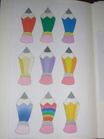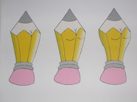
As you can see on the left I started off designing just the basic outline of the pencil. I wasn't too sure about the what colour I wanted my identity so tried different colours to see what worked well and what would relate to me, but looking at them I relised that the original colour worked the best. I used the gradient tool to add tones to give a more 3D look to the image. It took me along time to actually create this shape but I am pleased with the outcome.

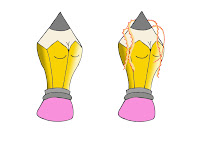
Once I had got my shape I thought that I would edit it to give it a more feminine look. The image on the right shows the process of how I did it. This was Roma's advice that I took and I really like it.

I came up with the idea to add pencil sharpenings to give out the impression of hair, this took me quite a while to create but I showed a few people the outcome and they were impressed. My decision now is whether to go for the pencil with the sharpenings or without, so I think that I am going to create the identity on 3D Max and see what feel looks better.

No comments:
Post a Comment