Sunday 9 December 2007

Visual Aesthetics

The objects value to me
OK now I know this object looks pretty dull and boring but to me this is something really special to me and the thought of losing is unimaginable. I received this ring for my 18th birthday from my grandparents. I've had it for nearly two years now

however it already has a great deal of sentimental value to me. To me this ring represents my grandparents showing how proud they are of me not to mention how much they care.

Function

I feel that the main function of this ring is to make your hand/finger look elegant. Another way to describe the ring is that it decorates the hands giving out the impression that the finger is longer and thinner.


Aesthetics


When someone first looks at the ring, the sparkle in the diamond is what catches the

audience eye. The diamonds on the base of the ring is what give the ring its beauty and glamour. When it is next to a light it shows off the smooth texture the the white gold has, this also adds a shine to the ring. There is a slight thinning around the bottom of the ring which can give a worn effect but this is covered by the finger.

Visually when someone looks at it close up, the detail within the base of the ring is minimal but it also doesn't take the attention away from the diamonds that are meant to show off the beauty of the ring.

I tried to show the glamour within the ring by using some back lighting how it is not as strong as I wanted it to be however the image on the left does show how it makes a finger look elegant, slimmer and also creates a false impression of the size of the finger.

Reflection on Interactive Narrative

For our third and final project we were given the task to create an interactive narrative.We were given the same main objectives as the other two project (stated in my other two evaluations)however we were also given a brief with certain objectives. These objectives were:

1 - Produce an interactive narrative using still images positioned onto the timeline in Flash CS3.
2 - This interactive narrative should utilise a branching structure that forces the user to make a number of decisions as they progress through the narrative piece.
3 - Narrative should be the primary concern.

I feel that I completed two of the briefs points however I didn't properly complete the second point. When I first started using Flash CS3 I found it very hard to

understand especially the Actionscript. I have a strong idea in my mind that I thought would work however trying to show this on Flash was not so easy. Every time I tried to create a button an error code would appear and I could not find where the problem was. This was one of the things that I found most difficult and it is definately something that I would like to improve on.


I am really pleased that I actually completed the narravtive because of all of the difficulties I had when trying to create the narrative, however I was really happy about the positive feedback that I received from users. They all said that there was a strong narrative that was easy to understand and they liked the fact that the user was guided to the end outcome.

If I had the chance to this project again then I think that I would definately input some branches into the narrative because even though the users liked the outcome I thought that it would get repetitive because there is only one storyline, but as I was really struggling with Flash I wanted to go with the safe option and start off with something simple yet effective which I think I have achieved.


What I really liked about this project is that it was an individual project. This was the first one that I did and as I result to this I was able to make all the decisions and choose what I wanted to do, which I really liked, even though I liked working in a group it was nice to make the choices.

Spatial Awareness

I have used the whole space in the frame with my photographic image partially because I wanted the viewer to have the impression that they were the person in the kitchen, however the downfall for this was that in some of the frames it was hard to see the text so there are a few slides that have different colour fonts whic looks a bit untidy, other then the text I feel that I used the spatial awareness well.

Media/text
I inputted text to give the viewer instructions that forced them to choose a certain object, this made the whole narrative alot clearly and alot more user friendly. I think that font was bold enough for people to see and I used the correct colours that contrasted well with the background.

Stills and Audio

My whole narrative was made up with stills keeping to the same theme which I feel was a conscious decision because it kept the narrative going. I wanted to add audio without lyrics becuase I thought that it would distract the audience however I am starting to try and create my own music because I cannot keep using other peoples work/music.

Audience Interaction

My main aim was to make sure I had audience interaction so I feel I completed this quite by asking the user to help 'make a sandwich', without the user that sandwich would not be made.

Like I said above my main improvement on this project is to gain more experience in the Flash CS3 software as I feel I could really benefit from this piece of software over the next few years.

Friday 7 December 2007

Final Edited version!!!

I have tried and tried to download my interactive narrative but nothing seems to work, I've tried exporting the work, publishing, using quicktime but nothing will let me I will continue to try until I run out of time :(

Some Flash ActionScript 3.0

Since I've been working on Flash and found it very difficult especially the actionscript I thought that it would be a good idea to put some of the phrases and different tools from flash on my blog for me to remember and to show what I have learnt on Flash.

gotoAndStop () : when a user clicks to go to another frame. The frame would be stated in the brackets.
MouseEvent: This action is the certain event that the user wants the mouse to do, they have a number of different choices.
CLICK - The simply clicks on the button when clicked.
Roll-over - Changes appearance when user rolls over button
Basic button - Has the same content in the 'up, down and over' keyframes, does not change appearnce during user interaction.

I still need to add more but I will add them gradually as I learn how it all works.

Leo Burnett

Whilst working on my interactive narrative I remembered back to my interview for this project and, the website that I presented and didn't realise until now just how relevant it is to the narrative I'm doing now.
The website is advertising the work of a graphic designer called 'Leo Burnett' Looking back now I realise that it was the audience interaction that caught my attention. As soon as you open the site you are greeted by a sketching pencil to which you have the option to do any sketch you. Not only that but the audience can decide where they want to go and what they want to see.


When I look at this site at a whole it is exactly the same as any other website that I have analsyed however when I look at this site it gives me the impression of being more flexible, it has a more easy flowing structure, some of the effects even look as though they have been used in flash (mouse rollover).
This is the type of website that I want to create and is another reason why I wanted to share it on my blog. To look at this site then the website is:

www.leoburnett.com

Interactive Narrative storyboard

Right I've now taken my shots for my narrative so I decided to show you the basic layout of the narrative, my storyboard!! another reason why I did this was to remind me how I wanted the narrative to work, looking at the layout on the storyboard showed what worked, what didn't work and other ideas that I could add. Initially I did not plan to have so many images of the kitchen but after looking at the storyboard it came to my senses that in order for the viewers to select the fridge or an ingredient then they would need a kitchen view to be able to choose where to go. I also input a plate image because my initial storyboard skipped from the sandwich being cut to the sandwich on a plate.

One small thing that I have noticed is that there are some pictures that have certain appliances and some images are missing those appliances i.e. the ham is not in the fridge. I have already put my images onto flash but if I get time (or if the ham hasn't been eaten) then I will try to change this.

My aim is to complete this narrative by Saturday, I have already edited it on flash so my my aim in my next seminar is to learn how to export it correctly, maybe even input sound audio? who knows...well until my next blog.

Thursday 6 December 2007

Flash CS3, eek!


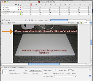
Ok so I've tried working on flash cs3 and I have to say that this is one of the most complicated pieces of software that I've seen!! if I had to describe I would say that its photoshop and premiere put together. It has the basic toolbox and timeline which I understand.


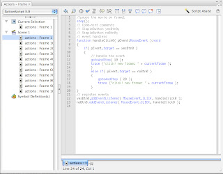
I do like that it has the layers tool, this makes it easier to separate different pieces i.e. the buttons, text, background etc however, what I find very confusing is the coding that enables the buttons to work, the actionscript. When I was shown in the example I thought that it looked complicated but with the help of the software tutorial I would be able to cope. Below is what the actionscript looks like:


From the tutorials online I gathered that the blue types were to signify a function that actionscript recognised. I think that the grey type siginfy what the user has created i.e. simplebutton yesbtn0 but this part I found very confusing and I will need to look into this further. For this project though I have used the template provided for us but I have tried creating my buttons but whenever I tested the movie it would run like a film so I need to work on that.

Other features that I felt helped me was the properties/filters box.


This box was quite helpful in a way that it showed me exactly what my buttons were called (this was important when applying button names in actionscript) everytime I looked at each frame in my timeline I was able to check that each button was assigned to its right frame. That was the properties section, the filter section reminded of Photoshop however the filter tab in flash helped me edited my text, this helped me in a way so the audience could clearly see the text over the background.


As a whole if you know how to use flash CS3 then I think that this program would be great. I am going to continue to work on this piece of software for practice in order to use it because from what I have seen from other examples the software look really interesting. What I have written above is some of the things that I started to learn, but I know that there is so much more I could do if I just try. I do know that I am in the same boat as everyone else, not many people have used this program and are finding it hard to work with as well.
I think that my next plan of action is to keep practicing, I have taking my images and I plan to show a few examples on my blog shortly, I need to input text onto my images so I may do that once I've got my images in the order that they are needed.

My plan for my interactive narrative

Right, I've decided to go with the 'How to make a sandwich' narrative. Reason for this was because from when I thought about the idea I had a clear idea what images I wanted to take and the steps in which the user would be lead too. I also thought that this would interact with the user very well because each step in the narrative will be asking the user to guide them to the next step.

This is a rough outline in which order my interactive narrative might go.

View of kitchen > close up of chopping board > image of loaf of bread > bread on chopping board > view of kitchen > image of butter > butter being spread > kitchen view > image of fridge > inside of fridge > image of tomato > tomato on bread slices > view of kitchen > select inside of fridge > pick lettuce > lettuce on sandwich > view of kitchen > select ham > ham on sandwich > finish sandwich > cut sandwich > sandwich on plate > end


This is a basic lay out of what I intend to do. I like this idea because its a simple idea to work with and as this is my first time working on flash then its a good project to start with. By the time I do my next blog I would hope to have used the flash program.

Monday 3 December 2007

Interactive Narratives

We had an introduction to flash CS3 on Friday and all I can say is WHERE DO I START!! I've never been on flash before so think that this is going to be a big task for me however with the help of the online tutorials I shall complete.

As I have never used flash before I aim to create a simple yet creative narrative that I know will interact with the user. I have viewed a few different interactive narratives and have decided that my narrative will involve users helping my actors in my narrative create something or do something.

These are a few of my ideas that I have come up with:

How do I make a sandwich?


This interactive narrative is basically what the title says 'How to make a sandwich?' The user will interact with the narratives by guiding the actors around the kitchen, however I want to give the impression that the users are the ones choosing where to go but I will input questions/quotes that will direct the users where to go. For example one of the quotes maybe 'I need to go to the fridge to get my ingredients' This will tell the user that they need to go to the fridge so, they will click on it.

Some of the shots that I could include could be an image of the inside of the fridge, kitchen utensils, prep table (where the sandwich is to be made)the complete sandwich/the gradual process of the making of the sandwich. Its a simple idea yet creative.

How do I tidy my room?


This interactive narrative has the same layout as the first narrative however it will be set in a bedroom. The process of this story is that the user gradually helps clear up the room by following the instructions/questions provided. I would set the bedroom up in a way that its easy to see where things have go i.e. clothes in the wardrobe. I like this idea however I'm not to sure how much things can do to keep this narrative going.

A guide to...


This idea hasn't been finalised but it would involve the user finding there way to a certain destination. They would start off at my place and I will give them a destination that they have to find. They will have certain choices in where they would like to go but if they make the wrong choice it will direct them either back to the beginning or, back to previous steps. It will give out the impression that they are going around in circles and will carrying on going around in circles until they reach the right destination.

These are a few of my main ideas but I just have to work out which shots will go in which numbered frame which I think will be the most difficult part however if I practice using flash I will gradually get the hang of this new piece of software.

Thursday 29 November 2007

Interactive Narratives - The Muppets movie


The muppets

http://muppets.go.com

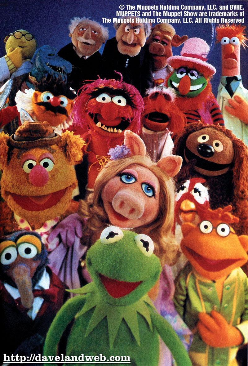
The final interactive narrative that I have found is the muppets website. I decided to do this one because of how much information I saw when I entered the site.

Even though it appears that the designers have used the whole page I actually noticed that they haven’t they have framed the main body of the site into a smaller frame and have used bright bold colours on the outside. I feel that for the target audience aimed at I think that the colours used were a good choice. I also like the framing used because to me, it gives out less impact.

Browsing through that site I realised that they have tried to use minimal text which is a good decision because of the younger target audience, the media text that has been used however is bold and the designers have used a good range of colours to make the text stand out.

Out of all three sites that I have anaylsed I feel that this site has the most use of animation. The main one that I noticed is that Kermit makes an appearance when the user clicks on a link and interacts with the audience. As you also navigate through the site there a number of different animations/videos that the user can watch and also interact with (some games) the different videos include advertising the muppets shows which I think maybe lose the interest of some viewers but a conscious decision because it is the official site.


There are a few still images throughout the site which show stories of the muppets themselves but in my opinion I feel that the animation is much stronger then the stills.

There is a range of different sound effects and music as you navigate through the sight. I like the audio because it changes every time you move to a different part of the site giving each page a different impression/atmosphere which the other two sites do not have.

The piece of criteria that mostly observed was the audience interaction, you can have the basic interaction but on this site the user can choose which part they want to go with the use of a map, showing them different areas with different themes. At first I found it hard to find the map which could be identified better but once found its very user friendly and fun for all ages I feel.

I have to say that this sit was the most entertaining because it had the user interacting most of the time, the only fault I could think of is that because there is such a large amount of imagery then the user is unsure on what they can and cannot select. They have to hover the cursor over the selected areas to realise that they can click on it.

http://muppets.go.com

Interactive Narratives - The Hejz

www.hejz.com
www.hejz.com

The second piece of interactive media that I found was a graphic designers own personal website called Peter Jaworowski otherwise known as ‘The Hejz’. The reason why I chose this website was because when I opened the site I was immediately greeted by an interactive spider diagram.

This immediately shows that the designers thought about the audience interaction with the site. What I liked about it was that the user does not have to click on anything to move the diagram around, the cursor guides the diagram around to how the user wants it, the Hejz work are the pieces shown on the diagram.

Looking through the site I have noticed that there are no videos but there is a strong amount of graphic work shown throughout the site however the user does have to select the pieces of work that they wish to view. Even though I liked the layout and imagery used I was a little confused with the media-text.

When I first opened the site I was really impressed but when I tried to navigate myself around the site I was confused where to go. There were no signs that clearly showed where you had to click to send the user to another page. The only way I could find where to go was to hover the cursor over the different pieces of font in hope to find something. However I thought the text used was slick and worked well with the designers work. All of the information was basic yet to the point. It stated the things that needed to be shown, some more information may have been useful but it may have lost the slickness that the site has.


When I look at the website as a whole I feel that the designers took spatial awareness into consideration. The whole layout looks well structured and spaced out evenly the only piece that doesn’t follow this is the spider diagram which I feel is a key point to the website so perhaps the designer could have worked in the same layout.

The audio on the site is basic with some simple pholie effects added but what I do like (like the terminators website) is that the audience gets the choice to have the music on or off.

The audience interaction is basic with the simple clicking, and reading however what I noticed on this page is that in the top left corner they show simple instructions on how to use the site with arrows, so this give the audience the choice between using the cursor or the keyboard which I like.

I think that this website advertises the graphic designers work well with the slick look but I do feel that the lack of direction lets the website down.
www.hejz.com

Interactive Narratives - Transformers

www.Transformers.com
www.transformersmovie.com

The first piece of interactive media that I found interesting was the web site for the Transformers movie. When I first opened the page it was clear to me that the web site was designed for a younger target audience. As soon as the page is opened you are greeted by a range of strong graphics that advertise the movie.

The designers have kept to the movie’s choice of text and has incorporated it into the website information, keeping the same theme throughout the whole site giving it a more professional look yet keeping the target audience attention. However I do feel that the text could maybe be kept to one colour because when looking through the site I got confused finding the different links because the fonts on some pages were different colours and I couldn’t work out which were links and which were not.

In my opinion I felt that the animations, videos and stills made this website complete. Each link takes the viewer to a different page (good and evil) with the choice to view each terminator. The website also provides a video trailer of the film which will be good for viewers who have not yet seen the film. I really like the effects used when the links changed, it relates to how the transformers change. What I feel makes all the still, videos and animation work is the audio.


Throughout the website the designers have use an electronic pholie. I feel that this keeps to the theme of the movie (robots, electrical etc). Not only is there pholie added to this site but, the user is given the option to listen to the soundtrack of the film, which I think is a good example of audience interaction.

This site lets the users interact as soon as the site opens by either choosing to ‘Protect’ or ‘Destroy’, once they have made their decision they are directed to the chosen site. Like I said above they have the choice of either having the sound track, other interactions would include the basic i.e. clicking, watching, listening etc.

There is a good use of spatial awareness with the page always full with different stills and animation. I also feel that the colours used were a conscious decision because they are simple and bold yet do not overpower the main focal point.

I feel that this is a well designed website and gives the audience what they want, keeps to the theme of movie and is finished to a high and professional standard.

www.transformersmovie.com

Monday 26 November 2007

Evaluation of One shot film

For our second project we worked around the subject of audiovisual. We were given objectives to complete for the project. These were the objectives:

1) Produce a basic presentation involving recorded sound and vision.
2) Understand the basic aesthetics of elements of a multimedia object.
3) Begin to understand the mechanisms by which people interact with media.

Looking at the three objectives I feel that we successfully completed the objectives given. Not only were we given objectives but we had to follow some rules outlining what we could with the film, these rules were:

- films should be between one and two minutes long.
- must use a tripod and can only move the camera once.
- during film edit you may not 'cut' the film image.
- must document process upon online journal.

I also feel that we successfully completed these rules.

Looking back at our project now I think that I am most pleased the editing. The reason for this was because in my first project this was one of my weaknesses however in this project it was my strength. I have been working on 'premierepro' to finish my film. I especially like the music, it was by another music act but I was the one who recorded the voice over. I feel that the voice over created the scene, it gives the film a plot rather then just being silent. If you also look at our unedited version you can see that the sounding is very unprofessional and doesn't reflect our genre of film.

Even though I like the sound effects I'm not so keen on the camera. Looking back at the film now I think that it would have been a better idea to have the camera shot zoomed in. Even though the viewers can see the body language of the actors however they cannot clearly see the expressions on their faces and I feel that that would have added more feeling to the film.

I feel that I could have put more effort into this project than I really did. I did get involved in every stage of the project and organise all of the camera bookings but I just felt that I wasn't getting as involved as I should have, I think this is because its something new and I wasn't to sure on what to do so if I was to do this project again but with something different to film then I will be more motivated.

On a positive note again we did work well in a group, making sure that everyone got their opinions taken into consideration. I feel that we were quite lucky with the lighting that we had. Its quite risky working with natural lighting however I think that we had just the right light, we even managed to incorporate it within our shot. If you look at the film you notice that Woody (Antony) walks into the light, we did this to try and reflect the signs between good and evil. We had planned to do this at night time however there were complications i.e. lighting and access to location.

Like I said above I was not happy with the camera shots, this was also some negative feedback that I received from viewers however the sounding made it work. I feel that this was a successful first one shot film because I learnt all of the basic information that I needed to know, and if do create a new film I will have a more open mind.

Final Edited version!!!

YAY!!! its finally here the edited version of my work. Here's my version of the one shot film that our group made, enjoy.


As this was my first time doing a one shot film I am pleased of the outcome, however next time I would make a one shot film I have some others ideas.

Thursday 22 November 2007

One shot film (unedited)

Right we have filmed the one shot film (HOORAY!!) This is our short film:


As you can see it looks nothing like our plans for the film that I intentionally wrote in previous blogs however, like I said before this is an unedited film. My plan of action when I edit this film is to create a black and white scene (maybe fog?) I want music that is not to slow that can create a loving yet mysterious atmosphere. I feel that having a script would ruin the whole scene but Danny has come up with the idea of whispering which I think will work really well because viewers will be able to understand whats going on yet having only whispers may direct the viewers attention to the actual film.

Storyboard and script

These are my storyboard designs that I sketched for our one shot film. At the moment I feel that my storyboard sketches are not very strong so I have just started with the basics and drawn simple human figures. The arrows on the images are to show people the movement in which the figures are about to move.


As you can see the sketches are very basic however I feel that they show the basic outline of how the film well.


Hopefully when we film the film is shot it will look something like my storyboard that I have sketched out.
Danny in our group also wrote up a script that we may use but, as we're trying to create a film noire this may not be used:


This is an image of the original script but as its quite hard to see this is what it said:

Mack: how have you been?
Delilah: I've been fine, how about you?
Mack: Does he know?
Delilah: (stutters)_ I don't know
Mack: Does he suspect anything
Delilah: I DON'T KNOW!
Mack: We can leave tonight, we can catch the last train to anywhere, me and you?
Delilah: Stop it, you know we can't afford to, we don't have the money ...
Mack: In this bag is £15 thousand, I know its not much but it's something, and a small price to pay for freedom.
Delilah: (begins to cry)
Mack: (hugs Delilah) It's ok, we're gonna be ok
Delilah: (shoots Mack as he falls to the floor she takes the bag and leaves the scene, while the camera keeps on Mack lying on the floor)


This is a basic script that Danny came up with but whether we shall use it is another question that we are still not sure about.

When we shoot the film we want the film to look like its been filmed secretly, we have all agreed that it would look more effective if it was black and white, doing this adds the effect of mystery. We want to set the camera at an angle that would only show 'Macks' face and viewers would only get small glimpses of 'Delilahs' face (would leave mystery as to who the murderer is)

Wednesday 21 November 2007

Group Members Tasks

Right I feel that our group have all different qualities that make us work well as a group, in my opinion these are the roles and the certain tasks that we all take whilst we work on this project:

Danny: Danny came up with the whole idea, so he's the one that will know exactly what to expect. His task was to create a plot for the film, however he also took on board the script and suggested shots that we could potentially use.

Woody: Woody also came up with an idea for our project, but in this film Woody is acting for us. His task was to create the atmosphere within the film with our other actress.

Hitz: Hitz I find is the one who works with the camera more so i'm guessing that he will be filming the shot however, Hitz also comes up with good suggestions to improve the film i.e. shows where the actors should stand in the film frame.

Me: I would say that my main role is to organise the equipment and arrange the place where we need to shoot. As Hitz and Danny work with the camera i'm tryin to design the storyboards for the film.

Because we all live in different places in nottingham we have mainly be contacting each other via mobiles and the internet, we also talk after our lectures briefly to keep everyone updated on what each member of the group are doing.

Something funny

Right this film might not be to every ones taste but when I came across it I just loved the voice over, It gave the film humour. I viewed the film twice one with sound and one without and when you look at it with no sound it just looks like a man running to his bike and riding away but with the sound it creates a story. It explains to the viewers why he's running so fast, why he falls off his bike and what the person at the beginning was doing, take a look for yourself and see what you think.


Looking at this film has shown me that maybe sound could change the impression of how the film is portrayed. Our group were trying to create a film noire but, maybe sound with give the film atmosphere, who knows we shall see how the film comes out.

The One Shot Process

Ok I haven't been on here for a while and apologies to Deborah for the late blog but I've finally got it all together. I think thats what my biggest weakness is (everyone will gradually notice this) I have to be organised before I can create something.

Right, in the time that we had for this project our group thought of a number of different ideas that we could use. Our two main ideas in brief were between showing viewers the effects of drug use, and a secret meeting between two lovers (in a film noire style). After discussing it we decided to go with the secret meeting.

The Plot


Mack and Delilah have been having an affair, when it comes close to Delilah's husband finding out, they decide to run away however Delilah has doubts on where her true feelings lie. In desperation Mack tries to persuade Delilah with a secret package (money for their future) however, in receipt to this package Delilah has different plans and kills Mack taking the money with her leaving Mack.

The location


These are a few photos of the location where we plan to shoot our film. When thinking on where to shoot we originally planned outside of a church or, shoot in the night however we all agreed that the lighting would be very poor as we cannot control natural lighting, and we thought that filming someone getting killed in front of a church would not be very appropriate (well thats my opinion). This is when we came up with the idea of a graveyard, to me it sets the scene for a secret meeting and fits well to the ending.

The photo on the right shows the camera angle for our final film. Our aim of this angle was to show viewers strong shadows, using this also balanced out the good and evil in the short film. The small tower would be the background of our film.

Friday 16 November 2007

One shot film

On our first seminar, for our second project Deborah set us the task to create a simple one shot film between one and two minutes long working with the titles 'irritation' or 'meeting'. The rules however were that we had to shoot the film in one shot (NO EDITING), we had to work in teams and the camera had to be on a tripod.

Our first idea we had worked with the title called 'meeting'. A couple would meet to either pass on a message or a letter however when thinking about this we thought that it was too serious and wanted to have some fun so we tried irritation. This film involved two students (me and Chase) trying to study and another more irritating student (Danny). As you can see in the film below Danny does every small irritating thing that someone could whilst the students were trying to study.

Harold was filming the one shot film, at first we thought using an angle shot would look more effective however Deborah suggested that we took the shot straight on, this way the viewers could easily see what was going on in the film.


If we had to do it again I think that I would make the film a bit shorter because when the audience were watching our film I got the impression that they thought it was getting a bit repetitive. I also think that working with lighting would have made the shot stronger but as we did not know how to work with the lights that was something that we were not able to do.

We have now finished shooting our final film so I will be shortly posting the film and all our supporting work on my blog.

Monday 12 November 2007

Light and Studio safety


Safety
In our seminar on Friday we were shown how to use studio lighting in a safe and sensible manner. One of the main priorities that we talked about was the safety in the studios.

One of the main things to think about when handling lighting is that the lights get can very hot so whenever people handle the lights they must always wear protective

gloves, with no holes or rips in them if you do find gloves with a rip then the gloves should be disposed of immediately in order to prevent them from being used by someine else.

With quite alot of lights being used within a studio means that there will be alot of wires lying around, having this could a bad accident i.e. tripping over the wires, to

prevent this people can tape the wire down to the floor however always throw away the used tape to prevent any mess. Also, covering the wires with a mat (preferably

rubber) will clearly show people where to walk and, cover the wires. When using the wires ALWAYS uncoil the wires, failing to do this is a hazard and very dangerous. It can cause an electric fire.

With the lights being very hot safety equipment on the lights is essential. If there is broken glass from the bulb then someone can easily cut themselves thats why a 'scrim' (a wire frame) needs to be in place in front of the light.Not only do you have to check for broken glass but the people using the light must ensure that the light is securely on the stand.

Sunday 11 November 2007

Reflection on Stop motion film

At the beginning of the animation project the objectives that were set were as followed:
- Produce a basic presentation involving sound and vision.
- Understand the basic aesthetics of elements of a multimedia object.
- Begin to understand the mechanisms by which people interact with media.
- Take an active part in teamwork.
- Assist in the production of multimedia material.

Looking at those objectives I feel that our group completed them, however improvements could have been made.

I am most pleased with what our groups outcome was because our work was very unique in comparison with everyone else. I feel this because we came up with the idea of not only just involving the group (the hands) but also including objects (play dough
man/tetris) each of these ideas were brought to the group by each member. If we had

more time though I think that we could have come up with more creative/unusual ideas. I feel that each group member took part with the use of the camera material, however if we were to do this project again then I think I would try and get more involved with the camera equipment because in my opinion that plays an important part in multimedia. Even though I wanted to get more involved in the equipment I researched into video production independently so I could get a stronger idea about the world of camera equipment and production, this is something that I intend to do in the future to give myself more information on the different areas of multimedia.

As a group we managed to create a short film/presentation however I myself found editing the piece was a weakness. I struggled batching the images however this was mainly due to technical problems, but it took me longer than intended to input audio

and upload the piece onto facebook. This is an area that I need to experiment with further in order for me to understand it in greater detail. I still also need to gain more experience in compressing my work in order to successfully download work onto 'youtube' which was one of our set tasks. I feel that the only way to work on these weaknesses is to keep on practicing and ask for more advice.

However I feel that completing the piece was a success and strong involvement from the group was a positive point because working in groups in the past was a weakness for me.

As a group we have decided to work together again because we all work well and contribute work to the set project but in the future I think that we all intend to try and be more outgoing and creative.

Thursday 8 November 2007

Animation final!

Well its taken me around about five weeks to do this but I can proudly present my final piece!! yay!! I may tweak around with before I hand it in but I happy about it, for now.

Single-camera video production

Looking at Deborah's reading list I noticed that this seemed to be the main book that she wanted us to read and having briefly scanned through it i'm glad that I did.


'single-camera video production' written by Robert B. Musburger gives us the basic introduction about how single camera video production works. From the start of the book Musburger explains in detail the different effects that could effect a production, however these are not about the camera in any but about we ourselves. Musburger explains how our senses are more powerful then the equipments sources. The other basic information that is included for example is the frequency, measuring sound/video and amplitude. All these help us to understand what we have to take into consideration in order to make a successful film.

Like other books I've read Musburger explains the different pieces of equipment needed, this to me would help the production team see what type of equipment they needed rather then just assuming they know.

However my favourite chapter is one of the shortest chapters but links to what I'm doing in my project and that is "The production process: Preproduction". In this chapter everything is explained from what planning stages are used (proposal, treatment, script etc)Before I read this book I did not realise that there was so many different types of scripts. The chapter also shows information that was not mentioned in our seminars i.e. location scouting/plotting and shows a strong example of a schedule.

The final chapters are about the involvement in the production itself. This also includes the lighting effects (three point lighting) framing, cover shots and what found interesting the camera effects that the camera itself can make.

I have only read this book briefly however from what I have read has given me more information and has made me interested so I am going to take a look at this book in more detail to help me gain a stronger idea about the world of single-camera video production.

Monday 5 November 2007

Audiovisual Seminar

On Friday we had our first seminar with Deborah on Audiovisual. We were also given our first task. Our task was to create a short single shot film (between 1 and 2 minutes). We were put into groups of four. I was with Harold, Danny and Chase. Deborah gave us two titles, 'irritation' and 'meeting', we started off with meeting however I did not feel comfortable with this so we changed it to irritation.

We came up with the idea of having two students studying and one student irritating the two students studying.

I felt that we did show irritation in a single shot film also adding humour, however if I was to do this film again I think that I would make it a bit shorter because I felt that we lost the audiences interest near the end.


An example of what we did is shown on a TV show called 'Trigger Happy TV'I have shown an example of this on this post just to give you an idea of what we did, but I am going to try and get our version because I would like people to see our first piece of AV.

Audiovisual Lecture

Deborah gave our group our first lecture on Audiovisual on Thursday. This involved looking at different examples of photos/images that would have a story behind them, however some of these photos could have a number of different stories, its how the viewer portrays the image.

We next moved onto single shot films where Deborah showed us examples of short films where the director used only a single shot to produced a film in ... a single shot.

To me this looks like a bit of a challenge, no cutting, no changing camera angles (except panning) just one shot eekk.


This is a single shot video designed by Geogre Barber. I tried to upload the film however it would not allow me but the image I show here is the the final outcome of the film.
A brief outline of the short film: A man unloads the contents of his van (cans of colourful paint) He gradually chucks each can of paint across the road leaving the passing cars to drive over the paint and create a bright/abstact image.

I like this film because its simple and also because of the strong camera angle. I feel that having the birds eye view of the film shows the viewer how strong the final outcome is and, I feel that having that camera angles makes the film successful.

Wednesday 31 October 2007

Bit of Trouble


Ok like I said in my last post, I was having trouble with the photo batching...yes thats still goin on and so I am returning to university and I will get it done but for now heres a few of the images that we have used in our short film. To the right you can see the hand with 'joe' he's our star attraction.


Oh and now to your left you can see joe slowly forming into model joe!!! Now I don't mean to brag but have you seen any other projects use plastersine in their projects. Only joking.


Wats this? Joe is dancing, look people we now have a play dough man dancing now if thats not cool then I don't know wat is wat could possibly happen next?


Hold the phone first of all hand, then Joe and now this!!! Well im not going to tell you how this story ends but for now i'm going to leave you guessing, but all I can say is that if all the projects are like this one then multimedia is going to be amazing!!!

xxx

Thursday 25 October 2007

Some Inspiration!!!

Ok so we've done our small film but whilst in our seminar this film was shown and this is where our group was inspired. It is the Guiness advert. I remember when I was younger I found this advert amazing and making something just like it seems so surreal, i'm making films!!!! well mini animations.


I think the main reason why I like this advert is because of the way the producers of this film managed to create a surreal/mind teaser out of just motion images. If I did decide to choose this pathway in my next two years a surreal piece would be something that I would like to look into.

Group work


Now that we have done are film we had to batch the photos together. This is a process on Photoshop which I didn't even know exsisted until last week however, I have been having a bit of trouble batching my images together. First attempt I ran out of time, second attempt it all batched fine bt it did not save so I was a bit confused and annoyed because I did all that work, but I am staying positive and going to attempt it again tonight fingers crossed that it works.
I feel that if I keep practising batching images I will get the hang of it so I thought to help me remember i'll write down how to batch images on my blog.

1) download images and also open Photoshop
2) Click Window > Actions
3) When acion window appears click 'create new set' > 'create new action' > record
4) Edit the image to how you want it i.e. contrast, hue/saturation. Make sure that image size is changed w=720 h=576 in pixels.
5) Save image (preferred to be saved as a 'PNG')
6) Close image
7) Stop recording
8) Click File > Automate > Batch

The Basics of video Production 'second edition'


Throughout this week I have been reading the book 'The basics of video production' written by Des Lyver and Graham Swainson. I chose this book to read because as I, myself am new to multimedia course I thought that it would be a good idea to start learning the basics of video production.
If I had to explain this book in one sentence then I would say 'a help guide through the basic principles of production'. The book explains in a step by step basis every detail of video production, starting from the where the television production is made. In the first chapter it decribes where the production is set and shows the readers a simple yet effective outline of a studio. This inlcludes explaining how the studio works i.e. the gallery (directors viewing point) the floor area (where the production is made) the sound control area and lighting. All of these areas are decribed in basic details but the reader can understand how the studio is set.
Des Lyver then moves onto the the team/crew who help create the production. There is alot of detail written about the director and PA to show people every aspect of their work. I feel that describing the PA's role in depth, in the production team was a conscious decision because before reading this book I did not realise that they had so much involvment/authority.
The following chapters not only describe the team but also what is actually involved within their section. This included sound team (sound supervisor, sound assistant and Boom supervisor). The lighting team (lighting director,operator,Gaffer and sparks) the camera team, the vision mixer, engineering team, floor management team, scenery team, wardrobe team and make-up team. All of these chapters explains what their jobs involve, what equipment is and how the equipment is used.
Des Lyver introduces the paperwork side of production near the middle of the book. The paperwork included the basic things needed to know i.e. script, storyboard etc however Lyver decribes why such paperwork is needed (for an aim and objective)
The main bulk of this book has been about studio production and it is not until near the end of the book that Lyver writes about single camera production (location production). Like previous chapters Lyver describes how a studio production works and what team members are involved in these chapters the single camera production is explained because of the difference in the two production a quite big i.e. camera team smaller, lighting is harder to control (natural lighting can't be controlled) sound has to be controlled.
Lyver also introduces the basic paperwork that is needed to create the production (chapter18) this would be the location agreement form, recce (location plans and drawings), insurance, screen script, call sheets (production crew avliabilty), logs of shots and copywrite agreements.
The final few chapters talk about editing the production, different types of editing techiques are explained (cut and slice, hybrid and non-linear) the team who edits the production consists of the director, PA, editor, tape operator, edit assistant and sound person. What I was surprised at was that Lyver also explains how an edit works.
Audio post production is final stage in the production and the last chapter, Lyver shows that audio post production can be as simple or more technical, its up to the director.

From reading this book I've managed to gain a basic outlook on what goes on, on a studio set, I did not realise the amount equipment needed and the amount of planning going into a production before its could be ready. I feel that this book is going to help a great deal in the future and it will be a reference book.

Thursday 18 October 2007

Group Animation film!!

I am pleased to say that our group managed to complete our animation film and I don't mean to brag but it is AWESOME!!! I have to say well done to Danny for making the model and Hitch for the cubes. When I first heard the plans for the animation I thought to myself hows is this going to work but looking back at the piece of work shows that it works really well together.

The reason why i like the idea is because it looks different from the other pieces that I have seen briefly, we have taken the examples of work shown in the seminars into consisderation to create a unique piece. We also looked at the module guide and tried to match the criteria however at this point in time I feel that we could have worked with lighting a bit however, the area where we shot the animation had a good source of natural light.

We have our next seminar on Friday which I am really looking forward too because we will be introduced to photoshop, this way we will be able to edit our animations to either make it look more professional or improve the animation.

Monday 15 October 2007

Whiteboard Animations

These are the whiteboard animations that we created the first week, I really enjoyed creating these because its something that I've never done before.

After looking at these animations makes me wonder what else we get to do on this course because if its similar to this I think that i'm going to love this course.

Sunday 14 October 2007

Pinhole camera Images

This is the image that I made using my pinhole camera.

When Isaw this image I was quite pleased with the outcome and shocked at the results because I was amazed at how a can could create a photo.


This was my second image that I developed. I was pleased with this image because I feel that it had a stronger contrast giving it more detail.

Saturday 13 October 2007

HOORAY!!!

YAY!!!
After three days of trying to log on to my blog i finally got onto my blog so this maybe quite a long story. Since the lats time i wrote on here I've had my first lectures, seminar and tutorial and, to be honest I happy about because that just shows everyone that im a proper student!!
Well I had my first lecture with Julius on Tuesday, having this lecture made me alot more confortable about the course because everything was explained about what we will be looking into and basically more info on the course. We were also given exercises to do with people which i found unusual however they were actually pretty good.
Then it came to Thursday Andy's lecture, Now this lecure i enjoyed because it was an introduction to animation and, since i'v havnt really looked into this area i found interesting,

"Pixilaxtion - Using people as puppets in stop motion animation"
"Pholie (I think thats spelt wrong) - The sound effects used for animation"

Those were some basic things that i remembered however i particulary liked 'Dave Borthwick' animation film (i must researh into it further) 'The secret adventure of Tom Thumb 1993' Other names that were introduced were Eadweard Muybridge (Human figure in motion) and Norman Mclaren (award winning film Neighbours 1952) All these animators all shows pixilation/animation in different ways and I feel can help me in the future.

And then came Friday. Andy was teaching us today, he gave us our first module guideline/schedule, first glance it looked scary but then i looked at it again and it wasnt to bad. I luckily got grouped together with three awesome guys (Danny, Antony and Hitz) and i think that we've got an amazing film idea but i wont say what it is until we start it, well we've done a bit that looks amazin, i hope it turns out well.

Friday 5 October 2007

My First week!!

When i first arrived to my new halls i was meeted and greeted by all my new flatmates who are awesome, From then we've been out together to all the freshers events including our fancy dress nights!!
Started my new multimedia course this week where we were lucky enough to make pin hole cameras with BEER CANS not forgettin our little animations which were super fun. Plannin to join a few clubs which will include dancing!!

From doing this multimedia course i hope to gain and learn new techniques esp in the animations sides maybe websites will be fun to make, i dont really i just looking foward to the next three years. I just want to gain skills that will help me succeed in life.

xx