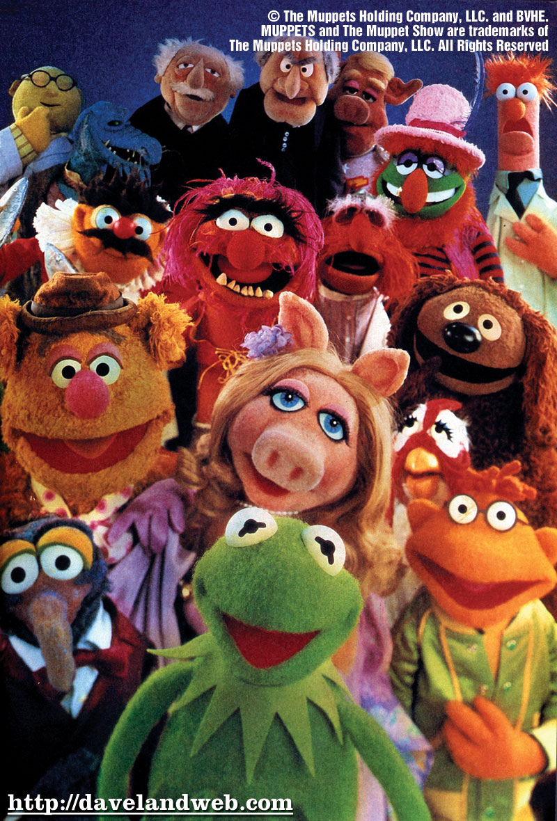
The muppets
http://muppets.go.com
The final interactive narrative that I have found is the muppets website. I decided to do this one because of how much information I saw when I entered the site.
Even though it appears that the designers have used the whole page I actually noticed that they haven’t they have framed the main body of the site into a smaller frame and have used bright bold colours on the outside. I feel that for the target audience aimed at I think that the colours used were a good choice. I also like the framing used because to me, it gives out less impact.
Browsing through that site I realised that they have tried to use minimal text which is a good decision because of the younger target audience, the media text that has been used however is bold and the designers have used a good range of colours to make the text stand out.
Out of all three sites that I have anaylsed I feel that this site has the most use of animation. The main one that I noticed is that Kermit makes an appearance when the user clicks on a link and interacts with the audience. As you also navigate through the site there a number of different animations/videos that the user can watch and also interact with (some games) the different videos include advertising the muppets shows which I think maybe lose the interest of some viewers but a conscious decision because it is the official site.

There are a few still images throughout the site which show stories of the muppets themselves but in my opinion I feel that the animation is much stronger then the stills.
There is a range of different sound effects and music as you navigate through the sight. I like the audio because it changes every time you move to a different part of the site giving each page a different impression/atmosphere which the other two sites do not have.
The piece of criteria that mostly observed was the audience interaction, you can have the basic interaction but on this site the user can choose which part they want to go with the use of a map, showing them different areas with different themes. At first I found it hard to find the map which could be identified better but once found its very user friendly and fun for all ages I feel.
I have to say that this sit was the most entertaining because it had the user interacting most of the time, the only fault I could think of is that because there is such a large amount of imagery then the user is unsure on what they can and cannot select. They have to hover the cursor over the selected areas to realise that they can click on it.
http://muppets.go.com

No comments:
Post a Comment