In the previous artefact the predicted results were correct however some of the participants made comments about the imagery used for the pairs games. The main intention for artefact 5 was to experiment the use of different imagery and to test whether using different images (colours, shapes and words) would make an impact on the participant’s timings and opinion to the games.
Following previous tests it was decided that new test subjects would partake in this artefact to make results fair as no child knew what to expect. The results received were interesting. The test subjects were split into literacy level groups to be tested however the results showed the children with lower literacy skill had quicker times than the higher literacy skilled group. The assumption was made that the children with more skills would work quicker.
The prediction was made that the ‘word’ matching game would take the longest although this was incorrect as it was the ‘colours’, which took the longest however the colour pairs game was played first so the participants were not aware of the game rules. Looking back the games should have been switched after each participant, making it fair.
Conducting this artefact has been very useful and has proved that imagery does not have a major effect on children with games, in spite of this gaming could potentially be a helpful learning source for children with lower skills. With artefact 5 showing that colours and shapes took the longest time in the pair’s game I have chosen to work around the theme of ‘colours and shapes’. The test will potentially consist of imagery and colour, possibly a colouring in picture. The aim will be to see whether computer technology can assist teaching methods in the subject of art and design.
Friday, 26 March 2010
Tuesday, 23 March 2010
Client Project - Validating/cross browser check

After having a few CSS issues with the drop down menu, the website now validates which is another tick off the box.
When it came to user testing I was happy to find that the website works across all browsers, this includes Opera, Safari, Firefox and Internet Explorer. However the only browser where I found an issue was in Internet Explorer 6. The drop down menu that I designed did not work in IE 6. Having tested it across all browsers it worked fine in spite of this IE6 would not allow the sub menus to show.
I edited the code in some places to try and get it to work however getting near to the deadline it was advised that I left this implication and made sure that it was noted down. Talking to tutors they advised me that this was the best solution, the majority of the users are now on updated versions of Internet Explorer however its more frustrating that it does not work in one browser.
Labels:
Client Project
Monday, 22 March 2010
PRP - The school visit!!

Ok I have just got back from the school and it has been the most useful day for testing that I have ever had. When I arrived the reception staff were very helpful. I arrived early to meet the other teachers as I had planned a range of activities which would be used across two different years.
Meeting Sarah (the year 1 teacher) she suggested taking groups of six to the ICT room in there levels of literacy. This turned out to be very ideal as I now could test the artefact on different levels of skill and see how that changed the result.
The children arrived at 9:15 and strangely starting doing a wake up exercise. I haven't been to school in years but this certainly was a good way to wake the children up. Having previously met the class for artefact two (interview) the chidlren recognised who I was immediately because I was named 'the game lady'.
When conducting the first group it took a little longer than expected because I wasn't too sure what would be the best way to work with the children. I was testing a number of different artefacts because I only had the one day to test so it was decided to allow the children to colour in whilst one child was taken aside to test the matching game.
I did not realise how much you have to take into consideration when working with children but everything had to be timed. I managed to get four groups done and recieved alot of data but I will have to review this later on.
Whilst at the school I also managed to hand out diaries to children in year 5. I found a site called 'Moshi Monster' that claims to be a helpful learning resource and also very amusing. Speaking to Sarah she thought that this would be ideal for the age group. A letter explaining the aim of the project has been written to the parent and a diary has been included so hopefully fingers crossed I should have some results.
Labels:
Prp Project
PRP - Fifth artefact, design update
Going into the school today so very excited but before I leave just wanted to post images of what I will be testing. My idea will be to test the participants by observing how they play the game and timing each game, noting each time they complete a level.
I am not sure how I will be working with the children but I will make sure that I report back after. Wish me luck!

I am not sure how I will be working with the children but I will make sure that I report back after. Wish me luck!

Labels:
Prp Project
Sunday, 21 March 2010
Client project - Search Engine Optimisation

Now that the site is nearing the finalisation stages I thought that it would be best to have the site up and running on google. Ashley provided me the link to instructions on how to upload a site onto google.
I have also included meta tags within the coding that will help better the websites chances at being the top of the google search list.
Having uploaded the street beatz site to google it is now third in the list which I am happy about because research has shown that the majority of people searching via google only look up to the third page before stopping. It came to my attention whilst doing this search test the name 'street beatz' is quite popular globally and though its on the first page of google, when you only type in the words 'street beatz' it nearer the bottom of the first page. Even though this is ok I want to try and push it closer to the top.
I am going to do some more research into how I can improve the SEO for the site and beat all of its competitors. I have spoken to Jess and it is agreed that I will also upload to bing and registar her with yell.com to put her in the business listings. I am hoping that this will increase the chances of the site becomming more popular as it will have more links to the site.
Having already got a google account I have created a google analytics account for the site so I can keep up to date on how many times the site has be viewed and which are the most popular pages. This will akso help me in my research as I can review back on which pages are the most popular, see what the average time spent on the site is and where the most popular link is to the actual site.
Labels:
Client Project
PRP - Fifth artefact, Boowa and Kwala website

On my searches for game examples I came across this website Boowa and Kwala Home - songs, games, stories...
"Educational games and activities for preschool, kindergarten and primary school kids, or Boowa & Kwala fans of any age !"
The Boowa and Kwala website is a perfect example as to what is needed in schools the site offers games to childrens at all levels of study. The site provides a variety of options to choose from starting from a specific category i.e. pairs, paint, puzzles etc following the desicion the user is directed to another page asking which game to play.

What I liked about this page is it provides information for the parent/teacher by showing what skills the activity will help. The are not all the same as they have been designed to help develop skills in an education world.
I did get slighty confused as to where I was being directed when selecting a pairs game so that could be a potentail issue although this site has been designed to play games and if a child finds a game then I assume they will be more than happy to play any of the games provided.
It is clear that the designers have thought about the target audience when it comes down to the design. Bright colours have been incorporated within the overall design. I also noticed that sounds have been used when clicking on buttons or playing games. Like in my previous artefact positive and negative sounds have been used to clearly specify whats right and wrong.

These elements are are very simple yet prove to work with the younger target audience. I am pleased that I have found this site it has provided evidence to back up my previous research artefacts.
Labels:
Prp Project
Saturday, 20 March 2010
PRP - Fifth artefact, imagery used in matching pairs games
When looking for ideas to inspire images for artefact five I decided to have a look at the matching pairs games that are actually out there. I looked at pairs games that are suitable for all levels and found four different examples.

The first game was a very basic game with simple icons. I got the impression that it would look like a simple desktop game (minesweeper, hearts etc) the pairing up was fairly slow however, having coded a pairs game I know that it is very difficult to code such things so I do not find this an issue.
I also noted that a timer had been added to the game giving the user the incentive to beat their personal skills.

The second game had a bit more detail and the shapes made it a bit more difficult to match the pairs up. What I liked about this game was that a points system was provided showing the user how many moves had been done and the score.
Seeing this gave myself the incentive of wanting to beat the personal score, time and reduce the amount of moves made. This proves that we need an incentive to complete games.

This game is particularly popular to me because I am very addicted to this game. The aim of Mahjong is to match the tiles however you can only select the free tiles. What draws me to this game is that you don't always win. Personally I find this addictive and aim to get one game complete but this can take many attempts.
This does not really provide a testing memory game but is a strong example of a matching pairs game.
These all provide good examples of what makes good ideas matching pairs games.

The first game was a very basic game with simple icons. I got the impression that it would look like a simple desktop game (minesweeper, hearts etc) the pairing up was fairly slow however, having coded a pairs game I know that it is very difficult to code such things so I do not find this an issue.
I also noted that a timer had been added to the game giving the user the incentive to beat their personal skills.

The second game had a bit more detail and the shapes made it a bit more difficult to match the pairs up. What I liked about this game was that a points system was provided showing the user how many moves had been done and the score.
Seeing this gave myself the incentive of wanting to beat the personal score, time and reduce the amount of moves made. This proves that we need an incentive to complete games.

This game is particularly popular to me because I am very addicted to this game. The aim of Mahjong is to match the tiles however you can only select the free tiles. What draws me to this game is that you don't always win. Personally I find this addictive and aim to get one game complete but this can take many attempts.
This does not really provide a testing memory game but is a strong example of a matching pairs game.
These all provide good examples of what makes good ideas matching pairs games.
Labels:
Prp Project
Friday, 19 March 2010
Client project - Global flash gallery
Like mentioned in previous posts I could not get the 'Next Gen photo gallery' to work properly on the website. Reason being that the plugins main purpose was for acting as a side bar widget and not a main focal point of a website.
After discussions with Shaun it was agreed that the best plan of action would be a flash gallery. I initially thought of having a flash gallery in the site but chose not to because of users not having a flash player. However looking back the majority of the people that I know already have flash player downloaded and so I decided to go ahead with a flash gallery, besides it looks more fancy and I believe that it will be more appealing for a the younger target audience.

I came across the 'Global flash gallery' plugin and after looking at a number of different galleries this one looked the most user friendly. I was not only trying to find a smart gallery but I was also looking for a gallery that would be easy to handle by someone who is not familiar with Wordpress. With this gallery the user is able to select the images that they require put them into different albums i.e. classes, competitions, shows etc. The user will then be able to select the photo's that they would like to be shown in the gallery and simply click the 'create gallery' button. this automatically gives the user the option to create a flashy gallery. I opted for the most simplest gallery because of the audience that the website is targeted at. To publish the gallery the user presses the 'publish' button and the gallery plugin code is supplied. The user just has to copy and paste the code on the page where they want the gallery to show.
I am pleased by what I have achieved considering I have been working on the gallery for over a week and achieving little results and even though I am happy with the gallery there are a few issues that need to be raised when handing my project over to my client:
- Each gallery that is upload can only hold nine images. This could be the size of the image even though I minimised the image size and so Jess would will have to switch the images of each album.
- When Jess wants to upload images she will also have to change the size of the images. Luckily I know she has experience in Photoshop so I can easily shoe her how to do this when I hand over the website.
The gallery is now up and running in not only the gallery page but also for the uniform as Jess wanted images of the different items of uniform that could be purchased.
After discussions with Shaun it was agreed that the best plan of action would be a flash gallery. I initially thought of having a flash gallery in the site but chose not to because of users not having a flash player. However looking back the majority of the people that I know already have flash player downloaded and so I decided to go ahead with a flash gallery, besides it looks more fancy and I believe that it will be more appealing for a the younger target audience.

I came across the 'Global flash gallery' plugin and after looking at a number of different galleries this one looked the most user friendly. I was not only trying to find a smart gallery but I was also looking for a gallery that would be easy to handle by someone who is not familiar with Wordpress. With this gallery the user is able to select the images that they require put them into different albums i.e. classes, competitions, shows etc. The user will then be able to select the photo's that they would like to be shown in the gallery and simply click the 'create gallery' button. this automatically gives the user the option to create a flashy gallery. I opted for the most simplest gallery because of the audience that the website is targeted at. To publish the gallery the user presses the 'publish' button and the gallery plugin code is supplied. The user just has to copy and paste the code on the page where they want the gallery to show.
I am pleased by what I have achieved considering I have been working on the gallery for over a week and achieving little results and even though I am happy with the gallery there are a few issues that need to be raised when handing my project over to my client:
- Each gallery that is upload can only hold nine images. This could be the size of the image even though I minimised the image size and so Jess would will have to switch the images of each album.
- When Jess wants to upload images she will also have to change the size of the images. Luckily I know she has experience in Photoshop so I can easily shoe her how to do this when I hand over the website.
The gallery is now up and running in not only the gallery page but also for the uniform as Jess wanted images of the different items of uniform that could be purchased.
Labels:
Client Project
PRP - Fifther artefact. start of design designing
Having decided what the artefact will be and having researched into different ideas I have decided to create four pair games with different images. The images that will be used are colours, shapes, words and TV characters.
The reason for why I have chosen these is because I want to stick to the learning aspect and research has shown that this colours, shapes and words are specific parts to a learning curriculum. TV characters have been included because I wanted to try and incorporate something that the children would recognise, maybe this could effect the way it has been designed?
I have included these changes within the flash game although this was not easy. I had to make sure that each piece of coding was adapted to seperate games. Problems that occurred included losing the sounding/animation and the overall game breaking. To resolve these problems each game has been put into seperate files with the seperate pieces of coding that is needed for each game.
The overal process was fairly straight forward but it is giving me a firmer understanding of working advanced actionscript coding.

Labels:
Prp Project
SPP3 - The not so successful images
Ok so I have been working on a few ideas for while now and I think that I have selected my final ideas, but that process wasn't simple and after going through a number of different designs I selected my final eight but thought I should share the ideas that were designed but not successful in the final outcome.

This image focused on only one shot of my personal portfolio, though the idea seemed good it was only presenting one image and I' prefer more than this.

This image exhibits more then one project however the audience see a minimal amount and so does not get the full outlook on the projects.

Again this shows four separate projects and unlike the previous project it shows the detail in each image, however I am not too keen in this general layout. I prefer the columns.
These are just a few of my extra designs but you can see in my previous blog posts that other design ideas have been designed for the assignment.

This image focused on only one shot of my personal portfolio, though the idea seemed good it was only presenting one image and I' prefer more than this.

This image exhibits more then one project however the audience see a minimal amount and so does not get the full outlook on the projects.

Again this shows four separate projects and unlike the previous project it shows the detail in each image, however I am not too keen in this general layout. I prefer the columns.
These are just a few of my extra designs but you can see in my previous blog posts that other design ideas have been designed for the assignment.
Labels:
SPP3
PRP - Fifth artefact, the use of imagery
I found this paragraph very interesting when I was reading a research document on Teaching visual imagery for vocabulary learning, the article can be found here
Scott, et al (2003) stated that creating visual images is useful when learning new words associated with known concepts or when learning definitions. According to van den Broek and Kremer (2000), students use mental imagery in reading to depict key text elements such as events, facts, and setting and to illustrate meaningful relationships between elements. Visual imagery assists students in learning word meaning and in making better predictions and inferences (Center, et al, 1999). Pictures can cue students with learning disabilities with decoding unknown words, can decrease task complexity, and can assist in developing memory for the written word (van der Bijl, Alant, & Lloyd, 2006). Visual imagery, as it is conceptualized by the author's of this study, is supported by Paivio's (1971) dual coding theory which suggests that verbal and non-verbal information are represented and processed in distinct but interconnected mental subsystems. Additionally, using visual imagery requires students to personalize word meanings (principle one), to build on multiple sources of information (principle three), and to connect what is personally known to new vocabulary concepts (principle four) (Blachowicz & Fisher, 2000).
Briefly reading through the paper showed that students use images to remember things, including words. The main aim of the paper was to research into teaching strategies. Teachers are comfortable with their teaching methods that when they go on education programs, the teaching strategies used are rarely used because they are unsure as to how it works.
The paper continued to discuss a test which was conducted based around visual imagery against word representation. The outcome showed that the visual imagery ahd the most popular results.
My initial thought for imagery was to improve childrens design skills on the computer although after reading this paper it has shown a whole new outlook on how the imagery could be used. This will be both useful for this artefact and artefacts to come.
Labels:
Prp Project
Thursday, 18 March 2010
Client project - Next Gen gallery
The Next Gen gallery has been ranked as one of the top photo galleries to be used by wordpress users. Its easy to use even for new users to wordpress and does require a flash player. Having also been stated in my wordpress book I thought that this would be ideal for the site...I was wrong.
It took me over 3 full days of work to try and get the gallery up and running however wordpress is completely new to me and still comming round to where all the files are suppose to be kept made the process of attempting to create the gallery even longer.

The user is greeted with a user friendly menu (left image) providing a straight forward step by step process on how to create your gallery. Starting by creating a gallery the user is able to create as many galleries/albums that they wish to use. The galleries and albums can also be created for the user if they wish to only use certain images as each gallery has an id number, the user simply has to change the id number the code provided (the code provided is just like the code produced from the contact form, shown in previous post).
Once you have added you images you can manage your gallery (image below). In the manage gallery section the user is allowed to add image descriptions, give the images titles for the users to see. Another section is also icluded to add details about the album i.e. add descriptions about the album. I did not use this part however I could see that it could be handy if the user had multiple albums.
Even though a slider effect (image would slide on to the screen) was included Next Gen gallery also allowed a Lightbox option though you had to have the plugin for this for it to work.

Even though the gallery sounded perfect and very user friendly it did not work for me. The first problem which occurred was that I could not alter the CCS code. However like I said before I am new to wordpress and without realising I had uploaded my CCS file to another folders when I had been previously working on the site. So whilst I was working on one file the wordpress site was pulling the information from another file.
Once this had been solved I managed (with help) to make the image display in line, but there's more. When I clicked on the images rather then displaying on the same page I was directed to another page. After days of working on the gallery I come to terms that I needed help.
With Shaun having a lot of knowledge on wordpress sites he immediately explained that the problem wasn't with what I has done but it was how I wanted to display the gallery. With wordpress being a site designed for blogs the Next Gen gallery was built to be a side bar widget, and so I was trying to ise it as a full gallery when its main purpose was for a side bar widget.
I understand this now but it is a little frustrating to know that the three days of trying to solve why it wouldn't work was all pointless because it was never built to work the way I wanted it too. But its good learning process and so its better that I know about it now rather then later.
It took me over 3 full days of work to try and get the gallery up and running however wordpress is completely new to me and still comming round to where all the files are suppose to be kept made the process of attempting to create the gallery even longer.

The user is greeted with a user friendly menu (left image) providing a straight forward step by step process on how to create your gallery. Starting by creating a gallery the user is able to create as many galleries/albums that they wish to use. The galleries and albums can also be created for the user if they wish to only use certain images as each gallery has an id number, the user simply has to change the id number the code provided (the code provided is just like the code produced from the contact form, shown in previous post).
Once you have added you images you can manage your gallery (image below). In the manage gallery section the user is allowed to add image descriptions, give the images titles for the users to see. Another section is also icluded to add details about the album i.e. add descriptions about the album. I did not use this part however I could see that it could be handy if the user had multiple albums.
Even though a slider effect (image would slide on to the screen) was included Next Gen gallery also allowed a Lightbox option though you had to have the plugin for this for it to work.

Even though the gallery sounded perfect and very user friendly it did not work for me. The first problem which occurred was that I could not alter the CCS code. However like I said before I am new to wordpress and without realising I had uploaded my CCS file to another folders when I had been previously working on the site. So whilst I was working on one file the wordpress site was pulling the information from another file.
Once this had been solved I managed (with help) to make the image display in line, but there's more. When I clicked on the images rather then displaying on the same page I was directed to another page. After days of working on the gallery I come to terms that I needed help.
With Shaun having a lot of knowledge on wordpress sites he immediately explained that the problem wasn't with what I has done but it was how I wanted to display the gallery. With wordpress being a site designed for blogs the Next Gen gallery was built to be a side bar widget, and so I was trying to ise it as a full gallery when its main purpose was for a side bar widget.
I understand this now but it is a little frustrating to know that the three days of trying to solve why it wouldn't work was all pointless because it was never built to work the way I wanted it too. But its good learning process and so its better that I know about it now rather then later.
Labels:
Client Project
Wednesday, 17 March 2010
Client project - Contact form
Another requirement for the website was to jhave a contact form that would go directly towards Jess's current email address. I have set up email account in one.com that was provided with the hosting address however, Jess had already printed all of the lealfets off with her email address and so the obvious solution was to create a contact form that was would send to her current email, keeping everything together.
"Plugins can extend WordPress to do almost anything you can imagine. In the directory you can find, download, rate, and comment on all the best plugins the WordPress community has to offer."
The beauty about being on wordpress is that is provides users with endless of plugins that makes blogs/sites easier and better to use. In my Wordpress book and a suggestion made by Ashley I used a plugin called 'contact form 7'.
This plugin is a very simple and straight forward plugin and I will show you how:
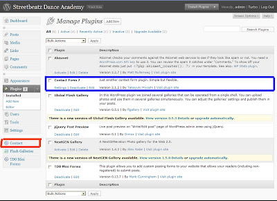
1) find and activate the plugin (blue box) once it has been activated click on the 'contact' button (red box)
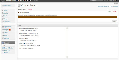
2) You will be opened to a page providing you with the contact form layout. This is the standard form that people want, if you require something different then click on the 'edit' tag under the contact button (that was previously clicked in the last instruction) here you can change the size of the size, input check boxes, quizes etc.
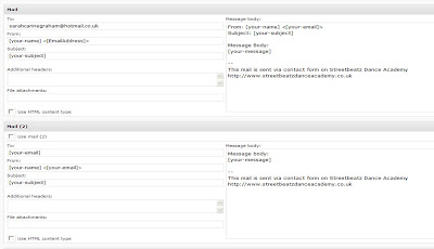
3) If you scroll down you will see how the form will be presented in the users inbox. In these boxes you have to add you email so the plugin knows where to send the form.
4) Once all settings are set scroll down to the bottom and click save. A piece of code (contact-form 1 "Contact form 1"]) will appear in the brown box at the top of the page (see in image 2) simply copy and paste that code on to the page you want it to appear and there you have one contact form.
I wanted my contact form to have smaller font then the rest of the site so I have created a new div and inputted into the page, creaing a new CSS rule for this. When I create the user guide I will have to make it clear to Jess that she must not delete any of these tags.
"Plugins can extend WordPress to do almost anything you can imagine. In the directory you can find, download, rate, and comment on all the best plugins the WordPress community has to offer."
The beauty about being on wordpress is that is provides users with endless of plugins that makes blogs/sites easier and better to use. In my Wordpress book and a suggestion made by Ashley I used a plugin called 'contact form 7'.
This plugin is a very simple and straight forward plugin and I will show you how:
1) find and activate the plugin (blue box) once it has been activated click on the 'contact' button (red box)

2) You will be opened to a page providing you with the contact form layout. This is the standard form that people want, if you require something different then click on the 'edit' tag under the contact button (that was previously clicked in the last instruction) here you can change the size of the size, input check boxes, quizes etc.

3) If you scroll down you will see how the form will be presented in the users inbox. In these boxes you have to add you email so the plugin knows where to send the form.

4) Once all settings are set scroll down to the bottom and click save. A piece of code (contact-form 1 "Contact form 1"]) will appear in the brown box at the top of the page (see in image 2) simply copy and paste that code on to the page you want it to appear and there you have one contact form.
I wanted my contact form to have smaller font then the rest of the site so I have created a new div and inputted into the page, creaing a new CSS rule for this. When I create the user guide I will have to make it clear to Jess that she must not delete any of these tags.
Labels:
Client Project
PRP - Fifth artefact ideas

Results from artefact four came out quite positive. For the first time since conducting the research artefact my predictions were correct. By adding the sounds and animation made the general game play a lot easier for the child to understand how to play the game.
With my predictions correct I decided to take a new route in the research. While observing the children play the matching pairs game I noticed that a few of the children made comments about the imagery used within the game. This gave me the idea that imagery could have an effect on the game play and learning.
Through the research carried out so far I am starting to realise that games are used within schools and are proving to be a good support tool but I am now trying to see what subjects computer games could be beneficial for. The aim of this next artefact is to test whether different images would effect the pairs game.
Sticking to the research subject I am going to use images which consist of words, colours and shapes. Using these different images could work out whether the use of different images effects that game play. I plan to test school children for this artefact as I will be visiting the school on the 22nd and the previous artefacts suggested that new test subjects would be beneficial and provide better results.
I am unsure as to what to expect from this artefact, preferably maybe show that matching words will be more difficult as they are not a shape however like already said I am unsure as to what the outcome will be.
Labels:
Prp Project
Tuesday, 16 March 2010
Supersized background image
For one of the requirements Jess asked for the website to look specifically like the leaflet that has been produced so I was provided with a copy of the files used for the design of the leaflet.
Taking into consideration of different browsers, screen sizes and resolutions I had to think of a way to create an effect background that would appear the same in all of the things that I considered to be a problem (stated above). Having attempted to create a standard background in the HTML page which was unsuccessful a jquery plugin was mentioned called supersized.
Supersized was a plugin created to make any image fit the browser screen whilst still maintaining the image. In other words the user can resize the to constraint and the image would remain the same dimensio ratio (until the screen is too small).
Whilst this all sounded a good idea and simple instructions were provided it was not as easy as it was made out to be. Setting out the code was fine and I understood that the image had to be a certain constraint however some of the coding became quite hard to understand. One big problem that always occurred was that when the browser window changed size the image would slide down the screen, showing a white background...not very appealing. The problem? a simple change of CSS coding. The problem is shown below:
The CSS code that caused the problem
#supersize img, #supersize a{
height: 100%;
width: 100%;
top: 0;
left: 0;
position:absolute;
z-index: 0;
}
and the CSS code that solved the problem
#supersize img, #supersize a{
height: 100%;
width: 100%;
top: 0;
left: 0;
position:fixed;
z-index: 0;
}
As you can see it was a simple change by switching 'absolute' with 'fixed' however this took many hours of work as we believed that the problem was with the code inserted into the HTML, but we were wrong and have learnt from our mistakes.
Another problem that occured was that my supersized background worked fine in FireFox however did not work in Internet Explorer (what a surprise). Having tried different options including contacting the designer of the leaflet and redesigning the background myself I found a simple solution, changing the image from a 'jpeg' to a 'gif'. It now works fine across all the broswers. HOORAY!!

Labels:
Client Project
Monday, 15 March 2010
SPP3 - Catalogue Ideas 3
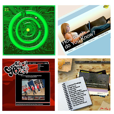
My third attempt of designs are starting to give my work more of an effect so I feel that I am going in the right direction.
This image would show the users a variety of my work that I have produced over the years at university.
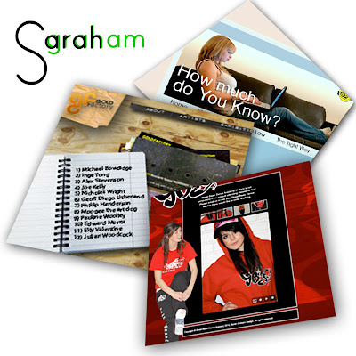
Since I found the transform tool in Photoshop I have felt the need to experiment with it, attempting to give the work a more 3D feel.
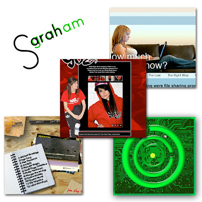
Not very keen on this idea. I was trying to experiment with layers but I feel that I was unsuccessful but I like the idea of incorporating my logo in with the design.
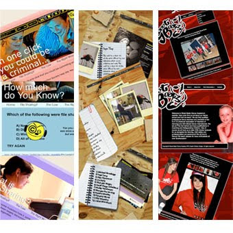
I like this idea. I have only stuck to three pieces of work but I have merged three separate pages from each of the sites together giving the viewer more visuals on each project.
This image would show the users a variety of my work that I have produced over the years at university.

Since I found the transform tool in Photoshop I have felt the need to experiment with it, attempting to give the work a more 3D feel.

Not very keen on this idea. I was trying to experiment with layers but I feel that I was unsuccessful but I like the idea of incorporating my logo in with the design.

I like this idea. I have only stuck to three pieces of work but I have merged three separate pages from each of the sites together giving the viewer more visuals on each project.

Labels:
SPP3
PRP - Fourth artefact evaluation
The results collected from artefact 3 were clear; having observed the children whilst conducting the test immediately showed that the child needs to have an incentive to continue game play.
The aim of artefact 4 was to test the use of sounds and animation. Pursing the creation of the pair’s game, positive and negative sounds were included within the game play with a ‘well done’ animation inserted at the end of the game. The aim was to test to see whether positive sounds changed the child’s reaction during the game play.
Results received from the artefact were positive. The results showed that the added sound effects gave the participants the enthusiasm to pursue the game play.
Observation showed that the child’s behaviour changed because the sounds represented a correct/incorrect answer making the general game play clearer to understand. Adding the animation also made it clear to the participant that the game was completed; this was another issue from the previous artefact that needed to be addresses.
During the testing a few of the participants made comments about the images used. If the option was given to redo the test then possibly changing the imagery from the previous test would have been beneficial as the same participants had been used for the same tests and this could have potentially affected the results.
With the results proving that positive sounds and animation make an impact on the game play the decision has been made to a different aspect of the game. Like previously mentioned children commented on the imagery. The next test will be based around imager. The aim will be to see whether the type of image used makes an impact on the game play. This will also test to see which imagery will work most successfully in a learning environment.
Labels:
Prp Project
Sunday, 14 March 2010
SPP3 - Catalogue Ideas, sticking to the right size
Having previously said before that I was struggling with compressing my work into boxes I thought that I should think of how to get around this. I found a simple solution and that is Photoshop editing.
The people who see the catalogue wouldn't know any different as they are only seeing the image on paper and so I think that I will have a look at how I can make my work stand out more by editing them in Photoshop.
Below is an example of how I have changed a screenshot to make the image look of a higher standard in a small area.
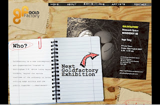
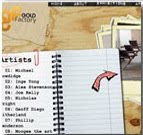
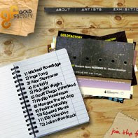
As you can see I have put them in order starting from the original image followed by the cropped image and finishing with the image that I edited in Photoshop. As you can see the Photoshop image has managed to include all of the main features whereas the standard cropped image shows little detail and does not really show people the whole design.
I have seen previous catalogue designs and the ones that look the most impressive have the full site in view.
The people who see the catalogue wouldn't know any different as they are only seeing the image on paper and so I think that I will have a look at how I can make my work stand out more by editing them in Photoshop.
Below is an example of how I have changed a screenshot to make the image look of a higher standard in a small area.


As you can see I have put them in order starting from the original image followed by the cropped image and finishing with the image that I edited in Photoshop. As you can see the Photoshop image has managed to include all of the main features whereas the standard cropped image shows little detail and does not really show people the whole design.
I have seen previous catalogue designs and the ones that look the most impressive have the full site in view.
Labels:
SPP3
Friday, 12 March 2010
SPP3 - Catalogue Ideas 2
Bearing in mind that we have a 11cm x 11cm space I thought that I would experiment with different templates as like we said in the previous lecture each student can do what they want with their own page.
I want to show various ideas so I though the best way to do that is have multiple boxes in which I can place my work in. Examples of these are shown below.


Having a template does give me the opportunity to exhibit more of my work so I think that I might take this approach. Though I am struggling to work with the spacing, I can't fit the work into the boxes that I want so this is something that I am going to look into later on.
I want to show various ideas so I though the best way to do that is have multiple boxes in which I can place my work in. Examples of these are shown below.


Having a template does give me the opportunity to exhibit more of my work so I think that I might take this approach. Though I am struggling to work with the spacing, I can't fit the work into the boxes that I want so this is something that I am going to look into later on.
Labels:
SPP3
Wednesday, 10 March 2010
SPP3 - Catalogue Ideas
Below are some more ideas on how to advertise the catalogue.


(This one was Ashley's idea but I was just testing to see what it looked like, will not be using this idea)


(This one was Ashley's idea but I was just testing to see what it looked like, will not be using this idea)

Labels:
SPP3
PRP - Fourth artefact, BBC interview
I came across this interview when searching for ideas. Derek Robertson who is apart of the consolarium (in previous posts) has an interview with the BBC. Robertson is trying to put the point across that computer games have proved to be successful in a learning environment.
Whereas the opposing side 'Michele Ledda' argues that using computing games is a bad choice. Ledda believes that the key way to motivate children are the teachers themselves. Ledda also thinks that computer games will soon make the teachers roles less important. If children believe that computer games are the source to learning then why should they listen to teachers? This is a point that I believe but I don't think that games should be completely wiped out of the learning system as they have been proven to be beneficial.
Robertson makes a good point at how its a new form of learning for not only maths and science but social skills. What we don't realise is that all games have some sort of learning outcome. What would be ideal is if a balance between gaming and learning was evolved. The teachers need to stay in control but, games are very strong supporting resource.
This interview has backed up my theory written in my research document and my opinion still stays the same, games should be in schools.
Labels:
Prp Project
Monday, 8 March 2010
PRP - Fourth Artefact, can games be motivational?

The issue with artefact three was that the children had to be continuously encouraged and praised in order for any progression to occur. A reason why I chose the subject of games and learning was because I genially believe that gaming could be the key to the support of some pupils. Everyone has different methods and I think this could be a possibility.
I came across the 'consolarium' whilst writing my research document and this company has the same theory as myself. Searching the website I came across a page describing reasons why gaming could help students.
The piece below has been taken from the page.
To develop successful learners the Consolarium argues that computer games can:
* act as a powerful motivational context
* provide powerful contexts for challenging and demanding problem solving
* implicitly develop the science model of enquiry in terms of developing learners ability to observe hypothesise, test, evaluate, conclude and refine ideas
* allow other curricular areas to be explored, enriched and excited by using the context within the game or by using the game as a context to jump into the more traditional curriculum
* provide contexts in which metacognitive awareness and development are essential for success. This means that the player must think about their thinking and understand they are a complex individual who can develop an awareness of how they think and learn and in so doing become an equal partner with the ‘more informed teacher’ in terms of the learning relationship.
As you can see I have highlighted the top quote. This was the problem which occurred when testing artefact three.
What I would like to find out however is what draws the child to play the game. From what I can see the consolarium tests the games on children, but do they actually know which components of a game keeps the child interested? Results from artefact three showed that encouragement is needed (prizes, incentives, levels etc), without any encouragement would the child actually play the game/? My results say that they would not.
Full details of the article can be found here
Labels:
Prp Project
Sunday, 7 March 2010
SPP - Image ideas
Starting on the new task of creating new images for task 2 I had a think about how to advertise my images. Below are some images on what I have created today. It's working progress but it's a start.
I got the inspiration from browsing through previous catalogues, these certain designs were the ones that caught my eye, the ones that made the web designs stand out. It wasn't until I started designing that I realised that it will be qutie difficult to capture a good image of a web site. The image after all will be all that the people at the exhibition will see.
So below are a few examples of ideas that I designed, some work and some don't but it has given me a good starting point.


All the sizes are different as the template that will be chosen for the catalogue will have different size images.
I got the inspiration from browsing through previous catalogues, these certain designs were the ones that caught my eye, the ones that made the web designs stand out. It wasn't until I started designing that I realised that it will be qutie difficult to capture a good image of a web site. The image after all will be all that the people at the exhibition will see.
So below are a few examples of ideas that I designed, some work and some don't but it has given me a good starting point.


All the sizes are different as the template that will be chosen for the catalogue will have different size images.
Labels:
SPP3
Saturday, 6 March 2010
PRP - Fourth artefact design
Well the design work is under way and it is going pretty well, even though I'm still struggling with the coding I am slowly making good progress. As you can see in the image below the current state of the game is just a basic matching pairs game with no sound, buttons, levels or animations. As I previously said that I wanted to add an incentive to the game to give the child encouragement to continue to playing I decided to opted for positive sound effects and animation.

I have kept the same 6x6 grid (something to possibly change at a later stage) so they only have to make eight matches.
Having to think about how to give the child positive feedback in a digital form was quite hard. Having already decided that a simple animation would be placed at the end of the game I had to think about how to draw the children to carry on playing. The only solution that I could think about was using sounds. When the child made a match they would receive a positive sound, and if no match then a negative sound.

Finding the sounds was the easy part it was the animation that was the most time-consuming. I had to create a new scene because there were a lot of tweens, also having the animation on a separate scene made the flash layout easier to understand and locate things.
I had to also consider what animation to design as I did not want to make an animation that would be more appealing towards the girls or the boys. Thanks to my housemates advice I chose to go for balloons, like a party. After many hours of creating balloons I managed to complete the animation and place it in the coding.
I've tested it and it all works well, the next phase is put it to the real test...the children.


I have kept the same 6x6 grid (something to possibly change at a later stage) so they only have to make eight matches.
Having to think about how to give the child positive feedback in a digital form was quite hard. Having already decided that a simple animation would be placed at the end of the game I had to think about how to draw the children to carry on playing. The only solution that I could think about was using sounds. When the child made a match they would receive a positive sound, and if no match then a negative sound.

Finding the sounds was the easy part it was the animation that was the most time-consuming. I had to create a new scene because there were a lot of tweens, also having the animation on a separate scene made the flash layout easier to understand and locate things.
I had to also consider what animation to design as I did not want to make an animation that would be more appealing towards the girls or the boys. Thanks to my housemates advice I chose to go for balloons, like a party. After many hours of creating balloons I managed to complete the animation and place it in the coding.
I've tested it and it all works well, the next phase is put it to the real test...the children.

Labels:
Prp Project
Friday, 5 March 2010
Client Project - Website drop down menu
Well it has taken me nearly 7 hours to create the final version of the drop down menu but it's now done and I am happy with the outcome but below is a short story board on how I got to my final stage.

1) First attempt of creating the drop down menu proved to be harder then anticipated, working with the alignment seemed to be impossible to get right, I found the code via the web (see previous post) however once opened the code there were many CSS elements that I did not understand even when I played around with every CSS rule.

2) As you can see I continued to work on this drop down menu and managed to get it to work to the websites look. The sub menus aligned well in firefox however, when I opened it in Internet Explorer I found that it did not work correctly. The 'hover' statement doesn't work on Internet Explorer and so after an hour or so of trying to tackle the problem I had to admit defeat and try a new piece of code.

3) Finding another code I thought more about the design, whenever I inserted a menu it would appear in a rectangle shape and it did not look right to me next to the logo, so I created a shape that I could put behind the menu giving it a more rounded edge effect. Finding a new code (WebDesignerWall) which I could easily implement meant that I could edit the code of the menu to blend in with the background.

4) As you can see in the image above the initial design had a pinky/red coloured background but it did not look right to me so working with a few colours I tried using it with a black background, and if you look below this is the most recent image of my work.

It may not look much but I'm happy with it and this is the actual site loaded onto Wordpress. I have been testing it across the browsers and apart from the background image on Internet Explorer like I previously mentioned it all seem to be working very well. My plans for the weekend now consists of getting the entire layout completed on Wordpress before tackling the plugins to get the gallery and comments up and running.

1) First attempt of creating the drop down menu proved to be harder then anticipated, working with the alignment seemed to be impossible to get right, I found the code via the web (see previous post) however once opened the code there were many CSS elements that I did not understand even when I played around with every CSS rule.

2) As you can see I continued to work on this drop down menu and managed to get it to work to the websites look. The sub menus aligned well in firefox however, when I opened it in Internet Explorer I found that it did not work correctly. The 'hover' statement doesn't work on Internet Explorer and so after an hour or so of trying to tackle the problem I had to admit defeat and try a new piece of code.

3) Finding another code I thought more about the design, whenever I inserted a menu it would appear in a rectangle shape and it did not look right to me next to the logo, so I created a shape that I could put behind the menu giving it a more rounded edge effect. Finding a new code (WebDesignerWall) which I could easily implement meant that I could edit the code of the menu to blend in with the background.

4) As you can see in the image above the initial design had a pinky/red coloured background but it did not look right to me so working with a few colours I tried using it with a black background, and if you look below this is the most recent image of my work.

It may not look much but I'm happy with it and this is the actual site loaded onto Wordpress. I have been testing it across the browsers and apart from the background image on Internet Explorer like I previously mentioned it all seem to be working very well. My plans for the weekend now consists of getting the entire layout completed on Wordpress before tackling the plugins to get the gallery and comments up and running.
Labels:
Client Project
Client Project - Suitable drop down menus
I wanted to make the streetbeatz website look as clean and user friendly as possible and so I decided that a drop down menu would be a good idea...though a little bit harder then your average menu.
When creating a drop down menu you have to take into consideration the different cross browsers, not to mention checking everything else because you need to make sure that the layout is compatible with all the browsers. The drop down menus has the same effect. Certain browsers are only compatible with certain CSS rules.
I tried creating my own drop down menus however none would work across Internet Explorer so I looked over the Internet for some suitable codes that I could perhaps work with.
CSS Play

CSS Play provided a good example of a CSS drop down menu, the article said that it was compatible across all browsers and even pointed out the bugs that occurred in IE6. However on reading further I noticed that the article/coding had not been updated since 2006 which meant that this coding may not be up to date with the current browsers.
Pure CSS menu

Pure CSS menu was an application that allows the user to easily create a drop down menu on the site. It gives you the option to change the colour, font and sizes. I had a go at it and it seemed pretty straight forward however when I tried to edit it I found it quite hard to understand the CSS coding and so thought that it would be wise if I created a drop down menu through a tutorial, that way I would follow the coding and would understand it which will enable me to edit the coding.
WebDesignerWall

As we all go on this site for some handy tips it was this one that I finalised my design for my menu with. The coding was explained in way that made the CSS a lot easier to understand. However I tried to edit the drop down menu I had to mix the coding up a bit because I could not get the code to go horizontal.
It has just shown me that creating a CSS drop down menu really isn't as easy as I thought it would be however I have found a lot of sources that could help me for future references.
When creating a drop down menu you have to take into consideration the different cross browsers, not to mention checking everything else because you need to make sure that the layout is compatible with all the browsers. The drop down menus has the same effect. Certain browsers are only compatible with certain CSS rules.
I tried creating my own drop down menus however none would work across Internet Explorer so I looked over the Internet for some suitable codes that I could perhaps work with.
CSS Play

CSS Play provided a good example of a CSS drop down menu, the article said that it was compatible across all browsers and even pointed out the bugs that occurred in IE6. However on reading further I noticed that the article/coding had not been updated since 2006 which meant that this coding may not be up to date with the current browsers.
Pure CSS menu

Pure CSS menu was an application that allows the user to easily create a drop down menu on the site. It gives you the option to change the colour, font and sizes. I had a go at it and it seemed pretty straight forward however when I tried to edit it I found it quite hard to understand the CSS coding and so thought that it would be wise if I created a drop down menu through a tutorial, that way I would follow the coding and would understand it which will enable me to edit the coding.
WebDesignerWall

As we all go on this site for some handy tips it was this one that I finalised my design for my menu with. The coding was explained in way that made the CSS a lot easier to understand. However I tried to edit the drop down menu I had to mix the coding up a bit because I could not get the code to go horizontal.
It has just shown me that creating a CSS drop down menu really isn't as easy as I thought it would be however I have found a lot of sources that could help me for future references.
Labels:
Client Project

