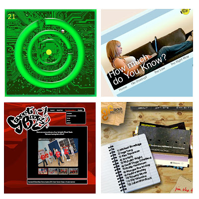
This image would show the users a variety of my work that I have produced over the years at university.

Since I found the transform tool in Photoshop I have felt the need to experiment with it, attempting to give the work a more 3D feel.

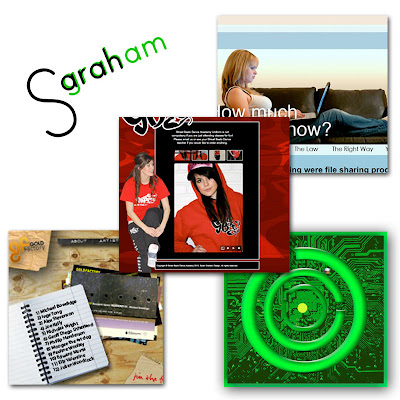
Not very keen on this idea. I was trying to experiment with layers but I feel that I was unsuccessful but I like the idea of incorporating my logo in with the design.

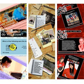
I like this idea. I have only stuck to three pieces of work but I have merged three separate pages from each of the sites together giving the viewer more visuals on each project.


1 comment:
the first idea seems to work best, but with the transform tool giving it a 3D feel to bring it alive works well too! the last one also looks cool but i would suggest making each strip look like one image otherwise it gets a bit confusing. :D awesome work, keep on it! x
Post a Comment