The people who see the catalogue wouldn't know any different as they are only seeing the image on paper and so I think that I will have a look at how I can make my work stand out more by editing them in Photoshop.
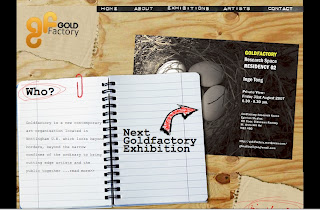
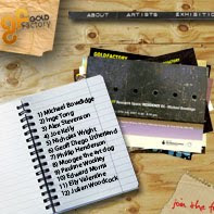
Below is an example of how I have changed a screenshot to make the image look of a higher standard in a small area.


As you can see I have put them in order starting from the original image followed by the cropped image and finishing with the image that I edited in Photoshop. As you can see the Photoshop image has managed to include all of the main features whereas the standard cropped image shows little detail and does not really show people the whole design.
I have seen previous catalogue designs and the ones that look the most impressive have the full site in view.

No comments:
Post a Comment